➡️ Introduction
A project’s story is often told not through words — but through visuals.
Charts, dashboards, and diagrams make it easier for stakeholders to see progress, identify risks, and make quick, informed decisions.
Top 5 Project Management Software
Visual reporting isn’t about decoration — it’s about clarity, comprehension, and communication.
When done well, visuals turn complex project data into insights that can be understood at a glance by both technical and non-technical audiences.
✅ Why Visuals Are Crucial in Project Reporting
✔️ Enhance understanding: People process visuals 60,000 times faster than text.
✔️ Simplify complexity: Charts summarize hundreds of data points instantly.
✔️ Improve engagement: Stakeholders retain visual information longer.
✔️ Speed up decisions: Visuals highlight issues before they escalate.
✔️ Build transparency: Everyone can see progress — not just read about it.
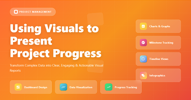
✅ Common Visual Tools for Project Reporting
✔️ Gantt Charts: Show project timelines, task dependencies, and deadlines.
✔️ Dashboards: Combine KPIs, milestones, and financials in one view.
✔️ Burndown Charts: Display remaining work over time in Agile projects.
✔️ Kanban Boards: Visualize workflow and task movement.
✔️ Pie / Bar Charts: Compare performance metrics and budget allocations.
✅ Choosing the Right Visual for Your Message
Match your reporting goal with the most effective visual format.
| Visual Type | Best For | Best Practice |
|---|---|---|
| 1. Gantt Chart | Tracking project timelines, milestones, and dependencies. | Highlight critical path and delays with color coding. |
| 2. Burndown Chart | Agile sprint tracking and workload trends. | Update daily and visualize target vs. actual progress lines. |
| 3. Dashboard | Summarizing KPIs, budgets, and resource usage. | Use minimal colors and auto-refresh data weekly. |
| 4. Kanban Board | Visualizing work-in-progress and task flow. | Limit WIP (Work in Progress) and label blocked tasks clearly. |
| 5. Pie / Bar Charts | Comparing categories like budget usage or defect types. | Avoid more than six categories — keep it readable. |
| 6. Heat Maps | Displaying resource load, risk intensity, or performance levels. | Use consistent color scales (green = good, red = concern). |
✅ Steps to Present Project Progress Visually
✔️ Step 1 – Identify Your Audience: Executives want summaries; teams need detail.
✔️ Step 2 – Choose the Right Metrics: Focus on KPIs that reflect progress, quality, and cost.
✔️ Step 3 – Select Visuals Carefully: Match the visual to the message (timeline, cost, or workload).
✔️ Step 4 – Keep It Simple: Use clear labels and avoid unnecessary graphics.
✔️ Step 5 – Update Regularly: Visuals should always reflect the latest data.
✔️ Step 6 – Use Dashboards: Centralize visuals for live tracking and easy sharing.
✅ Tools for Visual Project Reporting
✔️ Power BI – Best for automated dashboards and KPI visualization.
✔️ Monday.com – Combines data tracking and visual dashboards in one workspace.
✔️ Miro – Interactive boards for mapping timelines and workflows.
✔️ Smartsheet – Spreadsheet-like visuals with dashboards.
✔️ Excel / Google Sheets – Great for quick charts and Gantt-style visuals.
✅ Common Mistakes to Avoid
❌ Using too many visuals that overwhelm viewers.
❌ Displaying data without context or explanations.
❌ Failing to highlight risks or problem areas visually.
❌ Using inconsistent colors or unclear legends.
❌ Neglecting updates — outdated visuals lose credibility.
✅ Best Practices
✔️ Keep visuals clean, consistent, and data-driven.
✔️ Always label axes and timeframes clearly.
✔️ Use color strategically to guide attention.
✔️ Highlight trends, not just data points.
✔️ Tell a story with your visuals — every chart should answer “so what?”
✅ Final Thoughts
Visual reporting transforms data into decisions.
When done thoughtfully, it bridges the gap between project management and stakeholder understanding — making complex performance metrics simple, clear, and actionable.
A great visual doesn’t just show progress — it makes it impossible to ignore.