
➡️ Introduction
The Critical Path Method (CPM) is one of the most powerful tools in project scheduling. But understanding your critical path mathematically is only half the job — visualizing it in project management software is what actually helps teams plan, track, communicate, and make timely decisions.
Top 5 Project Management Software
Modern PM tools highlight the critical path visually, making it easier to:
✔️ see which tasks drive the final deadline
✔️ identify scheduling bottlenecks
✔️ model “what-if” scenarios
✔️ prevent hidden delays from turning into major overruns
This article explains exactly how to visualize the critical path in popular project management tools and why these visuals dramatically improve scheduling accuracy and team alignment.
✅ Why Visualizing the Critical Path Matters
Visualization makes complex schedules understandable at a glance. When the critical path is highlighted, teams immediately know:
- Which tasks must not slip
- Where risks and dependencies exist
- Which activities have float and which don’t
- What changes impact the end date
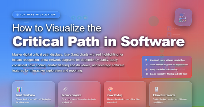
Instead of sifting through spreadsheets or lists, software highlights critical tasks in red, bold, or distinct colors, turning raw data into actionable insights.
✅ Where to Visualize the Critical Path (Tool-by-Tool)
Many scheduling platforms include built-in critical path displays. Here is how the visualization works in the top tools used by project managers today.
✔️ 1. Microsoft Project
Microsoft Project automatically identifies the critical path.
You can visualize it by:
➡️ Opening the Gantt Chart View
➡️ Enabling the Critical Tasks highlight
What you’ll see:
- Critical tasks appear in red
- Slack/float tasks appear in blue
- Dependencies are visually connected
MS Project also allows “what-if” analysis through drag-and-drop adjustments.
✔️ 2. Primavera P6
Primavera is widely used in construction and engineering.
You visualize the critical path by:
➡️ Running a schedule calculation
➡️ Turning on Critical Path View in Gantt or Network Diagram
What’s unique:
- Multiple critical paths
- Resource-driven critical paths
- Advanced filtering
This is the most precise tool for mega projects.
✔️ 3. Smartsheet
Smartsheet provides a simple, user-friendly visualization.
To view the critical path:
➡️ Create a project sheet with dependencies enabled
➡️ Turn on Critical Path Highlight under the Gantt settings
What’s shown:
- Critical tasks in bold red
- Automatic recalculation when dates shift
Ideal for hybrid teams needing clarity, not complexity.
✔️ 4. Monday.com
Monday.com displays the critical path through its Timeline and Gantt views, available in Pro/Enterprise plans.
You visualize it by:
➡️ Creating a board with dependencies
➡️ Opening the Gantt View
➡️ Toggling on Show Critical Path
Strengths:
- Highly visual
- Easy drag-and-drop rescheduling
- Works well for cross-functional teams
✔️ 5. Asana
Asana’s Timeline provides a lightweight critical path visualization through dependencies.
By enabling Timeline View, you can:
➡️ Map dependencies
➡️ Identify delays visually
➡️ Analyze bottlenecks
While Asana does not label “critical path” directly, the chain of zero-float tasks is easy to spot.
✔️ 6. ClickUp
ClickUp supports automated critical path calculation in the Gantt view.
You visualize it by:
➡️ Turning on Critical Path from the Gantt settings
Key strengths:
- Clean interface
- Adjustable dependency logic
- Strong for Agile + Waterfall hybrid teams
✅ What Critical Path Visualization Looks Like
While different tools use different colors and layouts, the pattern is universal:
- Critical tasks = red, bold, or highlighted
- Tasks with float = grey/blue
- Dependencies = arrows
- Milestones = diamonds
- Overall timeline = horizontal flow
This visual hierarchy helps teams instantly see what matters most.
✅ Benefits of Visualizing the Critical Path
✔️ 1. Faster Decision-Making
Leaders can instantly identify high-impact delays.
✔️ 2. Better Communication
Critical tasks become clear to everyone — no interpretation needed.
✔️ 3. Earlier Identification of Bottlenecks
Software highlights constraint points automatically.
✔️ 4. Real-Time Updates
When dates shift, the system recalculates instantly.
✔️ 5. Practical “What-If” Scenario Planning
Teams can test schedule changes without affecting the live plan.
✅ Common Mistakes When Visualizing the Critical Path
❌ Forgetting to set dependencies
❌ Not entering duration estimates correctly
❌ Failing to assign resources (if tool requires it)
❌ Assuming visualization equals analysis
❌ Not recalculating schedules after updates
Visualization is powerful — but only as accurate as the data behind it.
✅ Best Practices for Effective Critical Path Visualization
✔️ Always confirm your dependency logic
✔️ Recalculate the schedule after each update
✔️ Use consistent naming and coding for tasks
✔️ Review critical path during every status meeting
✔️ Teach the team how to interpret the visualization
⭐ Final Thoughts
Visualizing the critical path transforms a complex schedule into a clear roadmap. Whether you use Microsoft Project, Smartsheet, Monday.com, or any modern tool, the visual display of your critical path is essential for smart planning, proactive risk management, and data-driven decision making.
The more clearly you see your critical path, the more confidently you can control your project timeline.