➡️ Introduction
Progress reporting fails when people need explanations to understand it.
Top 5 Project Management Software
In many projects, progress is technically tracked but poorly communicated. Stakeholders receive dense reports, long status emails, or charts without context. The data is accurate — yet confidence is low.
Visual progress reporting exists to solve this problem.
When done correctly, visual reporting reduces ambiguity, highlights risk early, and aligns expectations without long explanations. When done poorly, it creates false confidence or unnecessary alarm.
This article explains how to report progress visually in a way that supports clarity, credibility, and decision-making — not noise.
✅ What Visual Progress Reporting Really Is
Visual progress reporting is not decoration.
It is the practice of translating project performance into clear, interpretable visuals that answer three questions instantly:
✔️ Where are we now?
✔️ Are we improving or slipping?
✔️ Where should attention go next?
A good visual replaces paragraphs of explanation.
✅ Why Traditional Progress Reports Fall Short
Many progress reports overwhelm instead of inform.
Common problems include:
✔️ too many charts without hierarchy
✔️ visuals that show status but not trend
✔️ inconsistent color or scale usage
✔️ charts disconnected from decisions
✔️ visuals updated infrequently
Effective visuals simplify — they do not impress.
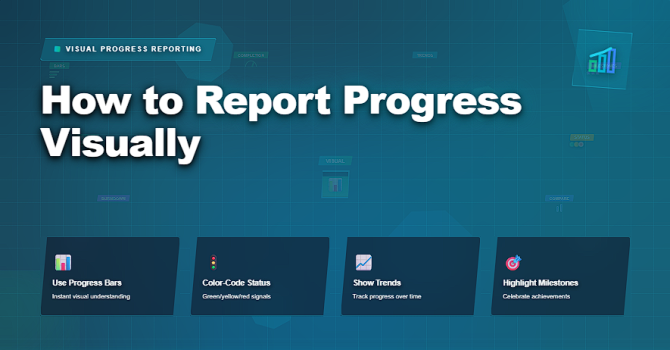
✅ Essential Visuals for Progress Reporting
Visual formats that communicate progress clearly and quickly.
| Visual Type | What It Shows | Best Use Case |
|---|---|---|
| Progress Bar | Completed vs remaining work | Simple status communication |
| Trend Line | Rate of progress over time | Early detection of slowdown |
| Milestone Tracker | Achieved and upcoming milestones | Executive-level updates |
| Burndown / Burnup | Remaining or delivered scope | Iteration-based delivery |
| Heat Map | Areas of risk or delay | Focus attention on problem zones |
✅ Designing Visuals That Support Decisions
Good visuals guide attention.
Key design principles:
✔️ one message per visual
✔️ consistent scales and colors
✔️ clear labeling and legends
✔️ emphasis on trend over snapshot
✔️ alignment with decision thresholds
If a visual raises a question, it should also suggest where to look next.
✅ Tailoring Visuals to the Audience
Different stakeholders need different visuals.
Project managers should:
✔️ use high-level visuals for executives
✔️ show detailed flow visuals to delivery teams
✔️ focus on milestones for sponsors
✔️ avoid overloading any single view
✔️ explain changes, not just display them
Visuals communicate best when they are context-aware.
❌ Common Mistakes in Visual Progress Reporting
❌ using too many colors
❌ showing only positive metrics
❌ hiding uncertainty
❌ updating visuals irregularly
❌ relying on visuals without narrative
❌ confusing activity with progress
Visuals should clarify reality — not decorate it.
⭐ Best Practices
✔️ standardize visual formats
✔️ update visuals on a consistent cadence
✔️ pair visuals with short interpretations
✔️ track trends, not just completion
✔️ use visuals to trigger action
✔️ remove visuals that do not inform decisions
⭐ Final Thoughts
Visual progress reporting is not about making projects look good.
It is about making progress understandable at a glance.
Strong project managers use visuals to create shared understanding, surface risk early, and align decisions without friction.
Projects succeed not because visuals are impressive —
but because they make reality visible in time.