
➡️ Introduction
Modern project management is no longer driven by intuition alone. With distributed teams, tight deadlines, increasing complexity, and rapid decision-making cycles, project managers need real-time visibility into performance.
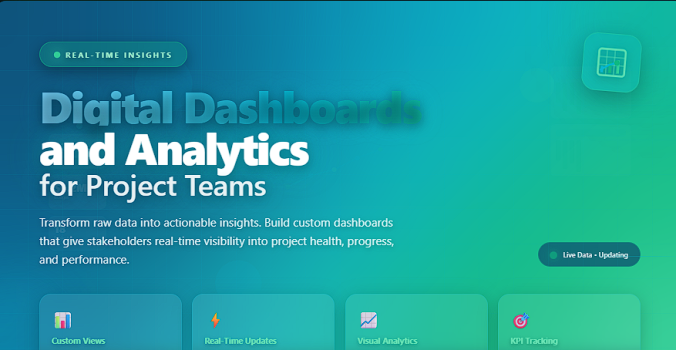
This is where Digital Dashboards and Analytics become essential.
Top 5 Project Management Software
A digital dashboard gives you a centralized, visual, automated summary of your project’s most important metrics—scope, timeline, cost, risks, resources, quality, and team performance—so you can make confident, fast, data-backed decisions.
Analytics turn raw data into meaningful insights:
✔ trends
✔ variances
✔ bottlenecks
✔ performance drivers
✔ predictive indicators
✅ What Are Digital Dashboards?
A digital dashboard is a real-time visual display of project data, designed to help leaders and teams track performance and communicate progress clearly.
Dashboards consolidate information from multiple sources—project plans, trackers, time sheets, budgets, PMIS tools, and workflows—into one interactive command center.
They help you:
✔ see the project’s situation instantly
✔ identify risks earlier
✔ control scope, cost, and timeline
✔ measure team performance
✔ communicate effectively with stakeholders
✅ Why Analytics Are Critical in Project Management
Analytics go beyond visuals—they help answer strategic questions like:
➡️ Are we ahead or behind schedule?
➡️ Is the team overloaded?
➡️ Which risks are rising fastest?
➡️ What is the forecasted completion date?
➡️ Are we burning more budget than expected?
Data becomes meaningful when analytics highlight:
✔ deviations
✔ patterns
✔ predictive outcomes
✔ resource utilization
✔ root causes
📊 Core Components of a Digital Project Dashboard
Everything a modern dashboard should include for full visibility and control.
| Component | Purpose | Example Metrics |
|---|---|---|
| Project Timeline Overview | Visualizes schedule progress. | % completed, delays, milestones at risk |
| Budget & Cost Analytics | Tracks financial performance. | Burn rate, actual vs. planned cost |
| Resource Utilization | Shows team workload and bottlenecks. | Allocation %, overbooking alerts |
| Risk and Issue Indicators | Highlights emerging threats early. | High-risk items, mitigation status |
| Quality Metrics | Ensures deliverables meet standards. | Defect rate, rework hours |
| Team Performance | Monitors productivity and efficiency. | Velocity, output, task cycle time |
| Stakeholder Engagement | Tracks communication effectiveness. | Response time, meeting coverage |
✅ Benefits of Using Digital Dashboards
✔️ Real-Time Visibility
Dashboards eliminate blind spots by giving you instant access to performance trends, delays, risks, and progress indicators.
✔️ Faster Decision-Making
Leaders can respond immediately instead of waiting for weekly or monthly reports.
✔️ Improved Team Accountability
Clear metrics show who is overloaded, underutilized, or blocked.
✔️ Better Stakeholder Communication
Executives prefer numbers + visuals, not long documents.
✔️ Predictive Insights
Analytics forecast potential overruns before they become visible.
✅ Designing Dashboards That Actually Work
A powerful dashboard follows these principles:
✔️ Keep it simple — highlight only the metrics that drive decisions
✔️ Use color intentionally — green, yellow, red for clarity
✔️ Show trends, not just snapshots
✔️ Avoid data overload
✔️ Make it interactive when possible
✔️ Tailor dashboards by audience (executive vs. team vs. sponsor)
✅ Tools for Building Digital Dashboards
Modern PMs use these tools:
✔️ Power BI — advanced analytics and visuals
✔️ Tableau — deep insights and storytelling dashboards
✔️ Excel / Google Sheets — flexible and accessible
✔️ Smartsheet — PM-focused dashboards
✔️ Monday.com — real-time project visuals
✔️ Miro — visual collaboration dashboards
✔️ Notion — lightweight, customizable dashboards
❌ Common Mistakes to Avoid
Avoid dashboards that:
❌ include too many metrics
❌ lack context or interpretation
❌ aren’t updated regularly
❌ show inconsistent formatting
❌ require manual data entry only
⭐ Best Practices for PM Dashboard Analytics
✔️ Combine lagging (historical) and leading (forecast) indicators
✔️ Build automated data flows wherever possible
✔️ Use standardized templates across projects
✔️ Integrate dashboards into weekly meetings
✔️ Track risks and issues visually
✔️ Set clear ownership for each data source
⭐ Final Thoughts
Digital dashboards and analytics have become essential tools for modern project managers. They enhance visibility, improve communication, strengthen decision-making, and reveal insights impossible to see in traditional reports.
The PMs who master dashboards don’t just track projects—they drive them with clarity, confidence, and data power.