➡️ Introduction
Timelines rarely collapse overnight.
They drift — quietly, incrementally, and often unnoticed.
Top 5 Project Management Software
In many projects, schedule issues are visible in the data long before they appear in status meetings. The problem is not lack of information. It is lack of visibility in the right form.
Dashboards exist to solve this problem.
When designed correctly, a timeline dashboard turns raw schedule data into early warnings, clear signals, and decision-ready insights. When designed poorly, it becomes decorative noise.
This article explains how dashboards should be used to monitor timelines, what they must show, and how project managers can turn dashboards into practical tools for schedule control.
✅ What a Timeline Dashboard Really Is
A timeline dashboard is not a reporting artifact.
It is a monitoring instrument.
Its purpose is to:
✔️ show whether progress matches the plan
✔️ reveal trends, not just status
✔️ highlight risk before deadlines slip
✔️ support timely decisions
A good dashboard answers one question clearly:
➡️ Are we on track — and if not, where and why?
✅ Why Traditional Schedule Reports Fail
Many timeline reports look impressive — and still fail.
Common reasons include:
✔️ too many metrics without hierarchy
✔️ static snapshots instead of trends
✔️ focus on task completion instead of flow
✔️ delayed updates
✔️ lack of context or interpretation
Dashboards should reduce thinking effort, not increase it.
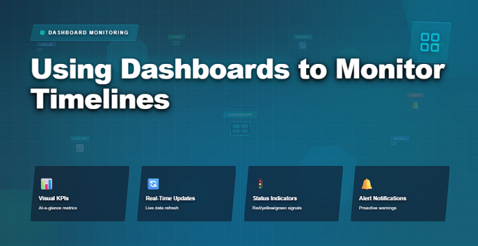
✅ Essential Timeline Dashboard Components
What a schedule dashboard must show to support control.
| Dashboard Element | What It Shows | Why It Matters |
|---|---|---|
| Planned vs Actual Timeline | Baseline dates compared to real progress | Reveals early slippage trends |
| Milestone Status | Upcoming and achieved milestones | Focuses attention on critical commitments |
| Critical Path Health | Status of zero-float activities | Directly impacts finish date |
| Trend Indicators | Direction of progress over time | Supports early intervention |
| Schedule Risk Signals | Areas with growing delay probability | Prevents last-minute surprises |
✅ Designing Dashboards for Decision-Making
Dashboards should prompt questions, not just show numbers.
Effective design principles:
✔️ one primary message per view
✔️ minimal metrics with clear thresholds
✔️ visual hierarchy that guides attention
✔️ consistent update cadence
✔️ visible trends, not static values
If a dashboard requires explanation, it is already failing.
✅ Using Dashboards in Project Governance
Dashboards are most effective when embedded into routines.
Project managers should:
✔️ review dashboards weekly with the team
✔️ use dashboards to support escalation
✔️ link dashboard signals to corrective actions
✔️ adjust plans when trends persist
✔️ avoid using dashboards as performance weapons
Dashboards support accountability — not punishment.
❌ Common Mistakes in Timeline Dashboards
❌ tracking too many metrics
❌ showing data without interpretation
❌ updating dashboards infrequently
❌ focusing on task completion only
❌ ignoring dependency-driven delays
❌ treating dashboards as executive-only artifacts
A dashboard unused is a dashboard failed.
⭐ Best Practices
✔️ align dashboard metrics with project objectives
✔️ track leading indicators, not just lagging ones
✔️ make timelines visible to the whole team
✔️ review trends, not snapshots
✔️ refresh dashboards consistently
✔️ act decisively when signals appear
⭐ Final Thoughts
Dashboards do not keep projects on track.
People using dashboards do.
Strong project managers treat dashboards as navigation tools — constantly checking direction, speed, and risk, and adjusting before obstacles become unavoidable.
Projects succeed not because dashboards look good —
but because timelines are monitored honestly and acted on early.